Saturday, July 17, 2010

2010: Year of the Redesign

Sometimes change is a good thing. I like when computers get faster, when cars get more powerful and more efficient, and when a band I like releases a great new album. Sometimes change is not a good thing, like when a website you visit regularly undergoes a major design change for the worse. This is the situation I have found myself in several times so far this year! In case you haven't noticed, I have a hard time dealing with change.

#1 - YouTube's 2010 Redesign
It all began with YouTube's new site design which launched at the end of March 2010. I feel that YouTube's new look is vastly worse than the previous version in several ways.

My grievances include:
· Video summary moved below player from right-hand side
· Home and History links disappeared
· Subscribe and Upload buttons moved, became colorless and joyless
· Five-star rating system discontinued
· Blatant Facebook ripoff "Like/Dislike" rating system implemented
· User comments no longer displayed in chronological order
· No separator bars between user comments
· Player volume control now horizontal instead of vertical


YouTube 2010 RedesignYouTube before and after the 2010 redesign.

In all honesty, the new YouTube redesign ranks up there with the Edsel, the Arch Deluxe, and New Coke in terms of failures. I'm not the only one who feels this way! Check out the 2,500+ comments on the YouTube Blog that echo my sentiments. The new design is an absolute travesty. Everything familiar has been discarded in favor of a new look that is about as intuitive as a tangled extension cord: where do you even begin?

This is a real shame because I used to love spending hours on YouTube looking up videos about anything and everything. Since their new design launched, I find I am spending less time on there and the time I do spend there is less enjoyable.

#2 - Google's 2010 Redesign
Next, we have the new Google homepage. Google is great at helping me find what I am looking for, but they are slipping when it comes to displaying that information to me. First things first: their logo changed in 2010. The new colors have more of a pastel look and the drop shadow is gone. Instead of looking at a search engine, I feel as though I am looking at a flat, two-dimensional page made for little kids.

Google 2010 RedesignGoogle's 2010 redesign features a subtle new logo.

But wait, it gets worse. The search results page now features a vertical column on the left-hand side of the page. Rather than filtering my search results to show only Images, News, and Videos on top of the search results page, the filter links are now on the left hand side. I don't like this position on the page, I don't like the icons, and I don't like that I cannot collapse the sidebar completely.


Google Bing SERP ComparisonComparison of Google and Bing Results Pages.

Most of all, I hate that the search results sidebar is a blatant rip-off of Bing. While we're on the subject, Google recently introduced a new "feature" that lets users randomize the background image on their homepage in June. Seriously, if I wanted my search engine and results page to look like they were made by idiots, I would just use Bing. Now that both search engines have nearly identical layouts, I'm left with no good alternatives.

#3 - Wikipedia's 2010 Redesign
Finally, let's take a look at the Wikipedia redesign which launched in April 2010. The new default theme is "Vector," which features clean lines and abundant gradients that have a very Microsoft-esque quality about them. The web's most famous peer-edited website is now one of the goofiest looking websites out there.

Wikipedia 2010 RedesignWikipedia before and after the redesign.

But the worst offense by far is the relocation of the search box from the left-hand navigation to the top right corner of the page. I never realized how much I use the search box until they moved it! After using Wikipedia regularly for years, I find myself frustrated and angry when I position the mouse cursor on the left hand side and my search box is gone! Arrgh!

They really missed the mark on this one. Articles written by committee seems to be working well for Wikipedia, but design by committee is not.

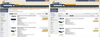
#4 - NewEgg's 2010 Redesign
NewEgg is the Internet's second-biggest Internet-only retailer after Amazon. They stock a wide variety of consumer electronics, computer parts, gadgets, and even appliances for sale. In 2010 their website underwent a face-lift, and I think the new look is definitely NOT an improvement.

First, the daily deals have been moved off the homepage to their own separate page. Now it takes an extra click to see what's on sale today. Content should get easier to find rather than being buried deeper into the site.

Newegg Site RedesignNewEgg's New Look for 2010.

Next, the font size on the product listing pages grew a few sizes. I'm not sure what it is about the font, but it doesn't look right in the context of the page. It's hard to get more specific about it, but I just don't like the way it looks.

Closing Thoughts
If I could communicate one thing to web designers, it would be this: remember that your site's user interface does not belong to you, it belongs to your users! Ask them for feedback, listen to the responses, and for God's sake if it's not broken, don't fix it!!

Let's just hope that craigslist never updates their interface.

I'm not the only one who feels this way:
http://youtube-global.blogspot.com/2010/03/new-video-page-launches-for-all-users.html
http://www.underconsideration.com/brandnew/archives/an_inconvenient_drop_shadow.php
http://blog.wikimedia.org/2010/a-new-look-for-wikipedia/

Tuesday, March 9, 2010

Automotive Design Disasters

When a car manufacturer decides to introduce a new vehicle, it takes dozens of people and many thousands of hours of work before the first completed vehicle rolls off the assembly line. These people work in teams to design the exterior, the interior, the engine, the chassis, and the suspension down to the finest detail.

Part of the automotive design process includes continuous peer review and design changes to make the vehicle look and operate as perfectly as possible.
However, I have to question the designers who put their stamp of approval on the following designs, because these vehicles have to be some of the worst automotive design disasters in recent history!

Scion xB Design Disaster
The 2007-present Scion xB has one glaring design error. Can you spot it? This vehicle has just one reverse lamp, positioned off-center on the left side of the bumper. Would you wear a pair of pants with only one back pocket? Would you listen to a stereo with only one speaker? Absolutely not! So why on earth would you make a car with only one backup light? I suppose this might look good if you are a cyclops or that chick from Futurama.
Mitsubishi Lancer Wagon Design DisasterHoly taillights, Batman! The taillights on this Mitsubishi Lancer Wagon are only slightly shorter than the Sears Tower. Not only will they make other drivers extremely aware of when you're coming to a stop, but if you live near the coast you can park this car up on a cliff and use its towering red lights to direct incoming ships safely to the harbor!

The Nissan Cube is neither hip nor square. It's not a van and it's not a sport-utility vehicle. It's not fast or sporty, nor is it intended for towing or going off road. I'm not really sure what it's purpose is, but this much I do know: it is hideously ugly from every angle!

Nissan aren't the only ones who can make an ugly, box-like vehicle. Take a gander at this Pontiac Aztek crossover! From its double-nostril front end to its plastic-clad sides and depressing roofline, this vehicle is an absolute monster that no doubt incorporates every single idea the design committee came up with. I cannot imagine why they stopped production after just 4 years...

Cadillac may be "The standard of the world" when it comes to luxury, but even the world-famous luxury car maker has had its share of design disasters. Take this Cadillac Seville for example. Its "bustleback" design looks less sophisticated and more like the car got rear-ended in a crash.
Speaking of ugly rear ends, check out the exhaust on this Porsche Boxster! That's right, a single pipe, dead center. Pardon my French, but the design and location of the exhaust pipe on this car looks just like an arsehole. I'm sorry, but there is just no nice way to call this one.
Hey, is that a pipe organ on wheels? Nope, it's just the rear end of a Lexus IS-F. The designers of this sporty sedan went more than a little overboard with the number four. Four doors? Check. Four wheels? Check. Four exhaust tips? "Oh what the hell, let's do that too!" they must have said. This is one design that should have been four-bidden!

A modern car is a complex system of electronic and mechanical systems working together in perfect harmony. In fact everything under the hood is so perfectly set in place that drivers are discouraged from ever knowing what really goes on thanks to the prevalence of plastic engine covers. These pieces of injection-molded junk are used excessively today in an attempt to limit access to your own car and to cover up the fact that today's engines look extremely lame.

The dashboard of the Toyota Echo may be one of the most visually unappealing designs I have ever seen. From its center-mounted instrument cluster to its shapely glove compartment, this thing looks like there was even less thought put into it than the movie "Gigli." How did they not realize how bad this looks?
Whether you're going to the moon or to the grocery store, the dashboard of this Nissan Quest minivan will make every trip and adventure! Its bizarre spaceship-like layout throws decades of intuitive and ergonomic designs out the window in favor of something that looks like a busy-box toy for adults.

Good God Almighty! The mother of all speedometers may be the single biggest thing about the Mini Cooper. The gauge is almost as large as the steering wheel, and is so ridiculously large that even blind people can see it. What an awful, awful design!

Look, I understand that designing cars is hard work - but we're not talking about putting a man on the moon, here. We're talking about shaping steel and glass into pleasing and practical shapes that people can feel good about buying. The majority of automakers have got this down pat - but as we can see here, some of them still need help when it comes to producing cars that are not disasters of design.

I am not the only one who feels this way:
http://blog.cargurus.com/2009/07/17/the-ugliest-cars-of-2009-and-2010
http://www.scottbradford.us/2010/01/12/the-ugliest-cars-of-the-2010-model-year/

Saturday, March 6, 2010

Extreme Consumer Products are Extremely Lame

All my life, I always thought that the world was a pretty normal place. But as it turns out, I was wrong. The world is a very extreme place. Life is just one heart-racing, adrenaline-pumping adventure after another. What's that? You mean your life isn't like that? Well, you'd think we were a nation of nonstop adventure junkies based on the skyrocketing number of extreme consumer products out there!

Xtreme Consumer ProductsI suspect that the flood of extreme consumer products began in the beverage industry. For years, extreme sports enthusiasts have apparently been unable to quench their "xtreme" thirst with ordinary beverages such as water, juice, and soda. This led to the development of energy drinks, which are carbonated beverages similar to soda but with absurd amounts of caffiene and other allegedly "natural ingredients."

One of the first xtreme beverages to hit the scene was Monster Energy Drink. Besides classic Monster, it is also available in several varieties including a low carb version and a coffee-flavored version. Monster Energy has branded itself as THE drink for the extreme lifestyle by sponsoring events such as motocross racing and the X-Games.

So if you play regular sports like baseball and basketball, you drink regular beverages. If you do extreme sports like backflipping an ATV over a train, you drink extreme beverages. Fair enough. But I think that the number of products claiming to be extreme is getting out of control. I'm sorry, I meant to say "x-treme."

We don't use regular toothpaste anymore, we use Aquafresh Extreme Clean. We can't just remodel our house, we get an "extreme makeover." We can't use ordinary deodorant, we use Right Guard Xtreme deodorant. We eat Xtreme flavored chips and snacks from Pringles. We snack on Xtreme Snickers candy bars. We connect to the Internet using D-Link Xtreme wireless routers. We work with Xtreme tape measures from Stanley. We chat on xtreme cell phones from Samsung. Even Hasbro is putting an xtreme spin on the classic board game "The Game of LIFE." Look for "The Game of LIFE: Extreme Reality Edition" coming soon!

The whole trend of mundane, everyday products being rebranded and reintroduced as "xtreme" products really bugs me. I am not a (completely) stupid person! I can tell that the only difference between regular Pringles and the "xtreme" Pringles is the label on the can and a little bit of flavor additive! There is definitely a limit as to how extreme a product such as potato chips can really be.

What if D-Link's regular routers transmitted information at 54mbps and the Xtreme routers transmitted information at 540mbps? What if Right Guard made a deodorant that you only had to apply once per week? What if Pringles started using capsaicin extract in their flavoring? These products would deserve to be called "xtreme" if they really existed. However, this is not the case with the products you see at the store labeled "xtreme." I think that "xtreme" products are NOT significantly more extreme than their competitors in any way.

The truth is, D-Link's regular and Xtreme routers contain the same electronic components and have the same function, but one has a slightly different package. Woo-freaking-hoo. At the end of the day, the Xtreme router is not xtremely faster than the regular one. The Xtreme Pringles don't taste all that different from ordinary Pringles. I don't have to handle them with gloves or keep them away from children. The Xtreme deodorant doesn't contain any magic ingredients not found in ordinary deodorant. There is absolutely nothing more extreme about a Stanley Xtreme tape measure over a regular tape measure that costs less.

Taking a regular product and re-branding it as an xtreme product is the hottest new trend in marketing consumer goods these days. This explosion of xtremely lame consumer products is xtremely annoying. At this rate, it won't be long before "xtreme" sounds as dated as other buzzwords such as "radical," "groovy," and "da bomb!" This is one marketing trend that I would love to see laid to rest.

Thursday, February 18, 2010

What's So Wrong With Sobriety?

Beer. Alcohol. Liquor. Booze. Whatever you call it, partaking in the consumption of spirituous beverages is one of the oldest human traditions. From disciples sharing wine with Jesus to the modern ritual of college beer pong, getting drunk has been a tradition throughout history. But for me, drinking is one activity that doesn't live up to the hype.

I've tried malt liquor, hard liquor, and a variety of mixed drinks. I've tried drinking with friends, by myself, and even in Las Vegas. I've had drinks at weddings, on New Years, and on special occasions. Each time it fell short of my expectations.

I cannot say that I have honestly enjoyed the taste of drinking or the way it made me feel. Drinking alcohol does not make me feel happy or awesome. It does not make me feel young or energetic. It just makes me feel kind of sick and leaves a bad taste in my mouth. It also makes me sleepy.


In fact, alcohol makes it very hard to do the things I enjoy such as thinking and making rational decisions. It makes it harder to speak, to read, and to remember things. Drinking impairs my ability to type and to drive, which are two things I enjoy very much.

I'm not straight edge and I'm not trying to force any kind of beliefs on you, dear reader. Honestly, it doesn't bother me at all that other people enjoy drinking.
All I'm saying is that when I tell other people I don't enjoy drinking, they look at me as if I had just sprouted a third eyeball in the middle of my forehead. They treat me like a social outcast. I often feel alienated from friends, family, and co-workers simply because I don't enjoy drinking.

For whatever reason, drinking is just not fun for me.
I have not found anyone else who understands the way I feel, because the only other non-drinkers out there feel very strongly about making a statement as they stand on some very high moral ground about the lifestyle they choose to live.

Some people assume that my dissatisfaction with alcohol is because I haven't found the right drink. These people will try very hard to pressure me into hanging out with them and going drinking. On the rare occasions when I do tag along, I am embarrassed for my friends as they slur their speech and act like fools. It's just not my idea of a good time.

I sometimes wonder if maybe there is something wrong with me. How can I be the only person who doesn't enjoy the celebrated act of intoxication? Everyone from the wino on the street to brilliant inventor and patriot Ben Franklin enjoyed the fermented beverage enough to promote its virtues to others.
So I ask you, what is so wrong with being sober? Why does everyone have to give me such a hard time about it? Is it really so weird that I don't think beer is the greatest invention ever?

I am not the only one who feels this way:
http://iusedtobestraightedge.com
https://web.archive.org/web/20101223084814/http://allphilosophy.com/topic/351
http://ask.metafilter.com/49711/Why-is-drinking-alcohol-not-enjoyable-for-me
YouTube: 80 Percent Of Roommates Got So Drunk Last Night

Wednesday, January 13, 2010

Why The Kindle, Nook, and Other E-Book Readers Suck

I like technology that makes sense and makes my life easier. Voicemail is a great idea because it lets people leave messages for me when I am busy. Cruise control on cars, that's another great invention. But I fail to see what's so awesome about electronic book readers like the Kindle, Nook, and Sony Reader.

Why E-Book Readers SuckElectronic reading devices are very trendy right now, and I just cannot figure out why people like them so much! When compared with traditional bound and printed books, it seems to me that e-readers are a vastly inferior technology. Here's why:

An electronic book reader is an expensive investment. Amazon's Kindle reader costs $259 for the 6-inch version and $489 for the 9.7-inch DX version. Barnes and Noble's Nook reader is also $259, and Sony's line of e-readers (cleverly named Reader - nice one, Sony) ranges from $199 to $399. Wow! Reading a plain old paperback book does not require any special hardware other than your eyes and your hands.

When you think about it, an e-book reader costs about the same as a netbook computer yet has less functionality. Both devices can display electronic books and RSS feeds, play MP3s, and access the Internet via 3G and Wi-Fi. However, a netbook can also be used to run programs, access email, watch videos, and more. Netbooks also feature full color screens and keyboards which make them much more suitable for accessing the Internet than e-book readers.

Another problem with e-readers is battery life. Both the Nook and the Kindle feature internal rechargeable batteries which last 10 and 14 days, respectively. However, both of these pale in comparison to traditional bound-and-printed books which never need to be recharged.

When it comes to durability, traditional books beat electronic readers into the dust. A paperback or hardcover book can survive getting banged around in a backpack all semester and still be perfectly readable. Accidentally dropping an e-reader could result in a scratched or cracked screen, or in the worst-case scenario, a $259 paperweight. Don't believe me? Check the comments from Kindle users on Amazon's Kindle Drop Test video.

Borrowing a hardcover or paperback book from a friend is extremely easy. Borrowing an e-book from a friend is, well, not so easy. Currently, Barnes and Noble's Nook is the only platform that lets you lend your electronic book titles to a friend. There is a maximum time limit of 14 days your friend must also have a Nook reader, PC, Mac, or iPhone. I hope Grandma can speed-read through Harry Potter in less than two weeks!

One heavily advertised feature of e-book readers is their ability to store up to 1,500 books on the device's memory. Now I don't know about you, but I usually just read one book at a time. It's nice that they give you so much space, but is it really necessary? E-books are not MP3s, and I honestly don't plan to read through hundreds of volumes of literature the way I would listen to hundreds of songs on an MP3 player.

When it comes to purchasing books, retailers such as Amazon and Barnes and Noble are quick to offer their electronic titles at discounted prices. Amazon has Dan Brown's "The Da Vinci Code" as a hardcover book for $26.40 or paperback for $9.99. Kindle users pay a paltry $6.39 for the same title in electronic format. It would seem at first that owning an e-reader would allow Kindle users to save piles of money on their book purchases, but sadly this is not the case.

The truth is that serious readers already know where to get the best deals on books. Whether it is trading in merchandise at the used bookstore, patronizing the public library, or browsing websites like half.com and eBay, true bookworms never pay the full cover price for their books. That same copy of The Da Vinci Code sells for just $0.75 cents on Half.com in Like New condition!

In many cases, perfectly good books can be purchased at thrift stores and yard sales for 50 cents or less. I picked up a mint copy of Herman Melville's classic Moby Dick (published by Bantam Books) for a mere 15 cents at my local Goodwill. The same book costs $4.95 for a digital copy at Barnes and Noble. Why pay the extra $4.80 to read about Captain Ahab on an electronic device if you don't need to? Electronic books are still not as good of a bargain as used books and probably never will be.

Additionally, I can think of several ways in which traditional bound-and-printed books will always be a better choice than electronic books. For example, my mother would absolutely love to unwrap the newest thriller from Jeffrey Deaver on her birthday. However, I cannot give her an e-book to unwrap, nor could I get it signed by the author at a book signing.

Non-electronic books are often gifted in other ways as well. Religious texts such as the Bible, the Torah, and the Qu'ran make excellent family heirlooms when they are handed down from generation to generation. Proprietary electronic devices do not. Honestly, do you really think your great-grandchildren will still be using Micro USB and 3G technologies decades from now? I sure hope not!

Regular books are also excellent for situations where I really would not feel comfortable using a $259 electronic device. Take the kitchen for example. A spiral-bound cookbook will always show your favorite recipes, even if it gets a little marinara sauce or water on it. E-readers are much more delicate and might not fare as well in a hot, messy kitchen environment.

Also, I can leave a regular book in my car on a hot summer's day in Phoenix without worrying about ruining it. That's something I cannot do with an e-reader.

Another great thing about dead tree books is that they can be used for the duration of a long flight, including take-offs and landings. People with electronic readers must adhere to the same strict rules as other personal electronic devices aboard an aircraft. Hope you don't have to land during a suspenseful part of the chapter!

Finally, there comes a time when every book lover must prune their shelves to make room for new books. It is easy for me to find a new home for books I did not enjoy or do not wish to keep any longer. They can be donated to charity, given away to friends, exchanged for credit at a local bookstore, or in the worst case, put in the recycle bin.

What do you do with the $4.95 copy of Moby Dick you purchased six months after you finished it? So far, there are no trade-in or buy-back options for e-books. You are stuck with them my friend, so choose your purchases wisely!

When you consider the high cost and limited functionality of today's electronic book readers, I just don't see why anybody would ever buy one! You don't need to read between the lines to see that traditional bound-and-printed books offer greater flexibility and freedom of ownership at lower prices than electronic books. So far as I can tell, e-books are a very innovative solution to a problem that never really existed in the first place.

I'm not the only one who feels this way:
http://www.markhaddon.com/e-books
http://mikeshea.net/Seven_Swords__44000_words.html
http://jasonkinner.wordpress.com/2009/09/07/a-few-reasons-e-book-readers-suck/
http://www.youtube.com/watch?v=GI0Zry_R4RQ