Sunday, February 24, 2013

The Myth of the Maintenance-Free Electric Car

Like it or not, the new age of electric cars is upon us. The Nissan Leaf, Ford Focus Electric, and Tesla Model S are the latest generation of pure electric vehicles to go on sale in the US.

Now I am not against the idea of electric cars. As a motoring enthusiast, my curiosity is piqued by anything with wheels and and engine, regardless of whether it runs on gasoline, diesel, propane, biofuel, electricity, or expensive champagne. However, there is one glaring inaccuracy about electric vehicles that I feel the need to correct.


I have read a great deal of news articles extolling the benefits of electric vehicles. Indeed, if you live in a city and primarily use your car for commuting, an electric car is a smart, environmentally sound, and efficient way to get around.

The part that gets me flustered is when a reporter claims that electric vehicles are "maintenance free." I can't tell you how many articles I've read that mention how the drivetrain in the Tesla Model S is so simple, it only has 3 moving parts. Buy one and all you will ever have to do is plug in the charger, right? Wrong.

While it's true that an electric car will never need to have its oil changed or a muffler replaced, there is still plenty of maintenance to be done.

Because it is still a vehicle that travels on the road, electric cars rely on rubber tires which must be rotated and kept at the proper pressure. By virtue of the fact that it has wheels, electric cars also need wheel bearings to help the car roll smoothly and brake pads to help the car stop - two more components which have a finite service life.

Electric cars have moving parts in the suspension and steering that use bushings which will, over long periods of time, wear out just like a fossil-fuel powered vehicle. Electric cars also have traditional car parts which are prone to breaking such as power windows, hinges, handles, and latches. Many of them have cabin air filters for the air conditioning system - another user-replaceable part.

Besides that, there are a number of specialty systems on an electric car which may need to be serviced. A pure electric vehicle will often rely on an electric powered blower motor for the heat and air conditioning. In the case of the Tesla Roadster, the battery pack is cooled with liquid, much like antifreeze/coolant in a traditional engine.

Again, I am not saying any of this to put down electric cars. Yes, I am aware that electric car owners will never have to get their hands dirty to change spark plugs and wires, an air filter, or engine oil. The traditional "tune up" will be a thing of the past. What I want to do is disspell the myth that by buying an electric car, you will be driving a magical "maintenance free" machine. There's still a lot to keep track of as a safe and responsible driver.

Wednesday, February 20, 2013

One Word Company Names

One of the most important things a company can do for itself is pick a good name. Historically, blue-chip American companies have names such as Bank of America, Coca-Cola, General Mills, and IBM. Lately, I've been noticing a trend in upstart American companies: they are all picking one-word company names.


Are these new generation of entrepreneurs trying to copy the success of Apple and Google? Possibly. Here are some of the new company names I've run across lately:

Box - Secure online file storage
Bump - Media sharing for smartphones

Canary - Wireless home security system
Coin - Replace multiple credit cards with one single card
Nest - The "learning" thermostat
Paper - Digital sketch book for iPad
Simple - Personal finance software
Square - Mobile payment processing
Stripe - Web payment processing
Vine - Looping video app from Twitter

Based on these companies, I have developed a formula for people looking to launch their own one-word startup company. Follow these easy steps and you'll be on your way to startup success in no time!

1. The Name
Obviously, it has to be a one-word name.
It should not be a portmanteau or empty vessel name like Groupon or Hulu, but an everyday word from the dictionary (preferably a noun).

2. The Website
The website must look really slick. Clean design with lots of whitespace and no more than 3 colors. Bonus points if your entire website is one long scrolling page (like an Apple product page).

3. The Video
The focus of your website is to get people to watch your introductory video, which is naturally hosted on Vimeo instead of YouTube, lending credence to the far more artistic-thinking audience your company cultivates. The video should not have any spoken dialogue, but should illustrate your company's product or service through a clever sequence of shots backed by an upbeat instrumental track and some inspirational words at the end.
(The similarities between Nest, Simple and Paper's videos are stunning).

4. The Press
Your company has to be mentioned absolutely everywhere. Not in mainstream media like the New York Times or Time Magazine, but on the web! You need profiles in FastCompany, TechCrunch, Engadget, Gizmodo, Huffington Post, Reddit, and all of the lower tier websites that scrape or syndicate content from the bigger ones.

5. The App
Whether the app IS your product/service or simply facilitates one, you need a mobile app. It has to be available for both iOS and Android platforms.

6. The Business Model
The product should use the freemium model in which some of the functionality is given for free, and members can subscribe for a low monthly fee to enable complete functionality. For product based models (such as Tesla or Nest) there should be no more than 3 variations of the product. Keep it simple.

Here are some new companies I have just now invented using my own formula:

Bound - An on-demand publishing service similar to LuLu, Blurb, and others.

Chain - A social app for cyclists. Hu ge with the fixed-gear hipster crowd.

Green - Um, I don't know? Something to do with finance and smartphones...

Ink - A cloud based printing service of some sort.

Ring - A virtual telephone number service (similar to Google Voice and Skype).

Snooze - Find a hotel room from your smartphone.

Whirl - A location-based photo sharing app (FourSquare meets Instagram).

Saturday, July 17, 2010

2010: Year of the Redesign

Sometimes change is a good thing. I like when computers get faster, when cars get more powerful and more efficient, and when a band I like releases a great new album. Sometimes change is not a good thing, like when a website you visit regularly undergoes a major design change for the worse. This is the situation I have found myself in several times so far this year! In case you haven't noticed, I have a hard time dealing with change.

#1 - YouTube's 2010 Redesign
It all began with YouTube's new site design which launched at the end of March 2010. I feel that YouTube's new look is vastly worse than the previous version in several ways.

My grievances include:
· Video summary moved below player from right-hand side
· Home and History links disappeared
· Subscribe and Upload buttons moved, became colorless and joyless
· Five-star rating system discontinued
· Blatant Facebook ripoff "Like/Dislike" rating system implemented
· User comments no longer displayed in chronological order
· No separator bars between user comments
· Player volume control now horizontal instead of vertical


YouTube 2010 RedesignYouTube before and after the 2010 redesign.

In all honesty, the new YouTube redesign ranks up there with the Edsel, the Arch Deluxe, and New Coke in terms of failures. I'm not the only one who feels this way! Check out the 2,500+ comments on the YouTube Blog that echo my sentiments. The new design is an absolute travesty. Everything familiar has been discarded in favor of a new look that is about as intuitive as a tangled extension cord: where do you even begin?

This is a real shame because I used to love spending hours on YouTube looking up videos about anything and everything. Since their new design launched, I find I am spending less time on there and the time I do spend there is less enjoyable.

#2 - Google's 2010 Redesign
Next, we have the new Google homepage. Google is great at helping me find what I am looking for, but they are slipping when it comes to displaying that information to me. First things first: their logo changed in 2010. The new colors have more of a pastel look and the drop shadow is gone. Instead of looking at a search engine, I feel as though I am looking at a flat, two-dimensional page made for little kids.

Google 2010 RedesignGoogle's 2010 redesign features a subtle new logo.

But wait, it gets worse. The search results page now features a vertical column on the left-hand side of the page. Rather than filtering my search results to show only Images, News, and Videos on top of the search results page, the filter links are now on the left hand side. I don't like this position on the page, I don't like the icons, and I don't like that I cannot collapse the sidebar completely.


Google Bing SERP ComparisonComparison of Google and Bing Results Pages.

Most of all, I hate that the search results sidebar is a blatant rip-off of Bing. While we're on the subject, Google recently introduced a new "feature" that lets users randomize the background image on their homepage in June. Seriously, if I wanted my search engine and results page to look like they were made by idiots, I would just use Bing. Now that both search engines have nearly identical layouts, I'm left with no good alternatives.

#3 - Wikipedia's 2010 Redesign
Finally, let's take a look at the Wikipedia redesign which launched in April 2010. The new default theme is "Vector," which features clean lines and abundant gradients that have a very Microsoft-esque quality about them. The web's most famous peer-edited website is now one of the goofiest looking websites out there.

Wikipedia 2010 RedesignWikipedia before and after the redesign.

But the worst offense by far is the relocation of the search box from the left-hand navigation to the top right corner of the page. I never realized how much I use the search box until they moved it! After using Wikipedia regularly for years, I find myself frustrated and angry when I position the mouse cursor on the left hand side and my search box is gone! Arrgh!

They really missed the mark on this one. Articles written by committee seems to be working well for Wikipedia, but design by committee is not.

#4 - NewEgg's 2010 Redesign
NewEgg is the Internet's second-biggest Internet-only retailer after Amazon. They stock a wide variety of consumer electronics, computer parts, gadgets, and even appliances for sale. In 2010 their website underwent a face-lift, and I think the new look is definitely NOT an improvement.

First, the daily deals have been moved off the homepage to their own separate page. Now it takes an extra click to see what's on sale today. Content should get easier to find rather than being buried deeper into the site.

Newegg Site Redesign
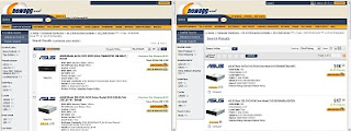
NewEgg's New Look for 2010.

Next, the font size on the product listing pages grew a few sizes. I'm not sure what it is about the font, but it doesn't look right in the context of the page. It's hard to get more specific about it, but I just don't like the way it looks.

Closing Thoughts
If I could communicate one thing to web designers, it would be this: remember that your site's user interface does not belong to you, it belongs to your users! Ask them for feedback, listen to the responses, and for God's sake if it's not broken, don't fix it!!

Let's just hope that craigslist never updates their interface.

I'm not the only one who feels this way:
http://youtube-global.blogspot.com/2010/03/new-video-page-launches-for-all-users.html
http://www.underconsideration.com/brandnew/archives/an_inconvenient_drop_shadow.php
http://blog.wikimedia.org/2010/a-new-look-for-wikipedia/